Listen to the Podcast:
Back light has long been the go to look when trying to make images that are pleasing to the eye. There are numerous benefits to using back light in your set ups but this podcast will be ignoring all of those and delving into the uncharted world of front light.
Situations and locations can dictate the light for a seen and in today's breakdown episode we look at one way to deal with front light when your hand is forced. It isn't always easy and it certainly isn't always pretty but with a little outside the box thinking you can some nice results.
Sponsored By:
The Problems with Front Light
The problem with front light is it is the exact oppostie of back light. Back light gives you so many advantages on the road to get a pleasing image it is hard to imagine consciously choosing not to use it.
But there are times and places where you must embrace front light and that is what today's show is about. So what are the "gotchas" with front light?
1. The background will not be in shadow which means it will be harder to pull the viewers eye where you want them to look.
2. Getting contrast and shape in the image will be difficult as the front light will be washing it all out with flatness.
The Spot: Dealing with Front Light
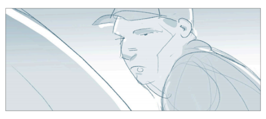
The ad we are looking at today required us to shoot in a very specific location at a very specific time. Because of these limitations we were forced in to trying to create a look that would end up being front lit.
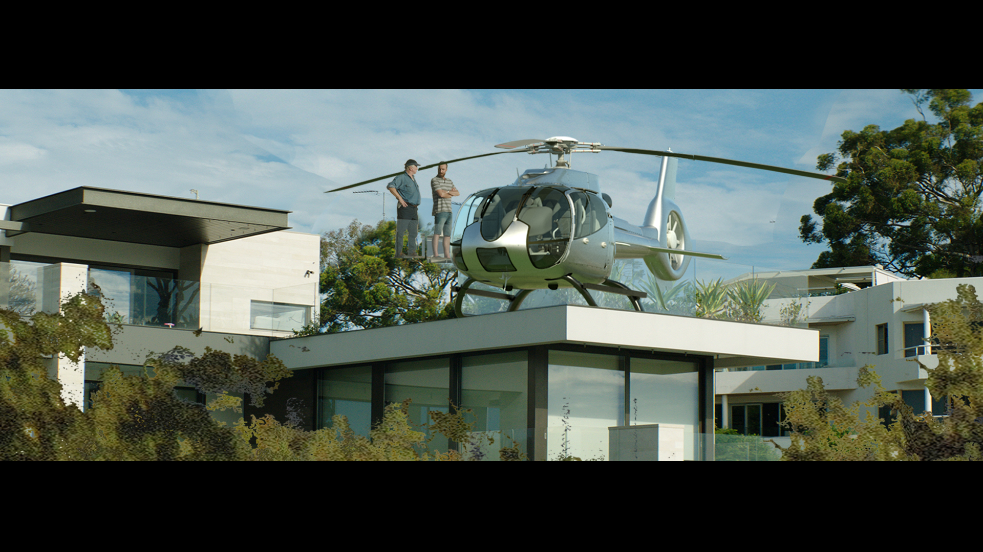
The main chunk of the ad is two gentlemen talking back and forth and the gag is revealed when we pull back to see the setting they are in.
Let's take a look at the shots and the location map to see why we needed to shoot it the way we did.
The Location: All Hail Front Light
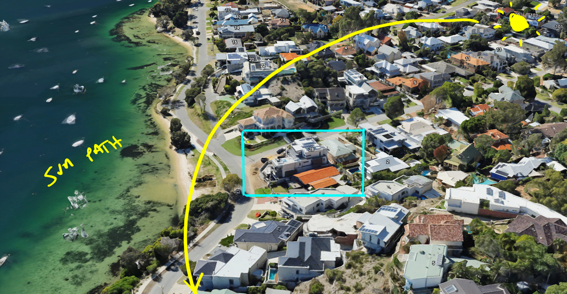
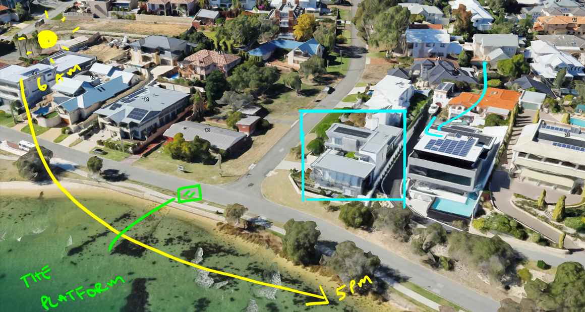
Here is a google earth shot of our location. The light never passed anywhere near behind the house which meant we had to choose a different look for this ad.
In the image below you can see where the house was located in relation to where we shot the singles of the talent. The platform were we shot the talent was raised about 6 feet off the ground in the middle of the road.
The Gear: Lighting and Camera
Camera Gear List:
- Arri Alexa XT - 800 ISO, 25fps, 180 degree shutter
- Hawk C SeriesAnamorphics (35, 50, 75, 100)
- Arri WCU-4 Follow Focus System
- Bright Tangerine VIV Matte Box
- Formatt Hitech Firecrest IRND - (.3 - 2.1)
- Oconnor 2575D Fluid Head + Sticks
- SmallHD 703 High Bright On Camera Monitor
- FSI CM240 - Director's Monitor
Lighting Package:
- 12x12 Ultra Bounce
- 12x12 Solid Black
- 12x12 1/4 Grid
- 4x4 Black Floppies
The Shots - Front Light
#1 The Conversation - In Tight
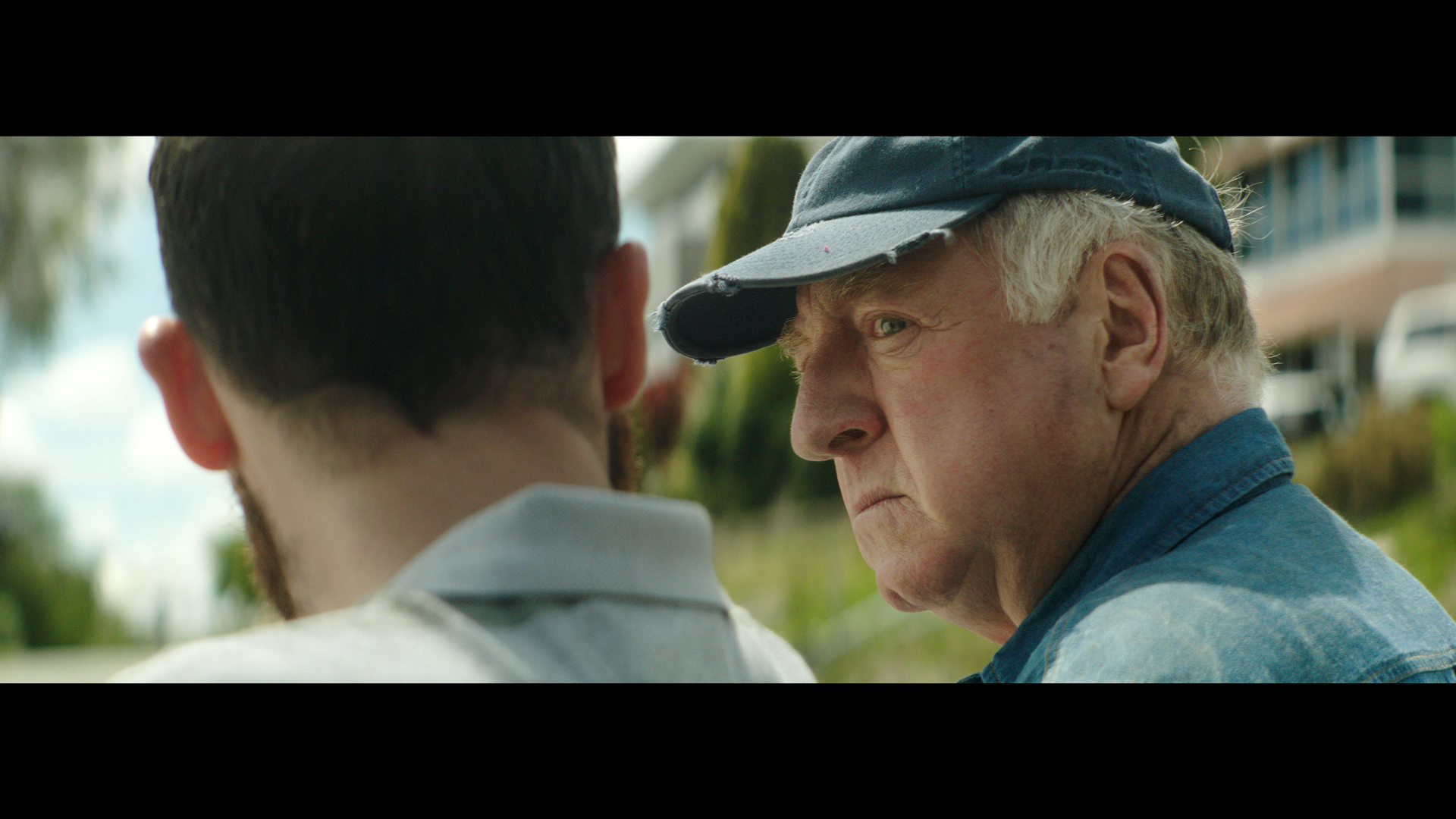
The Shot
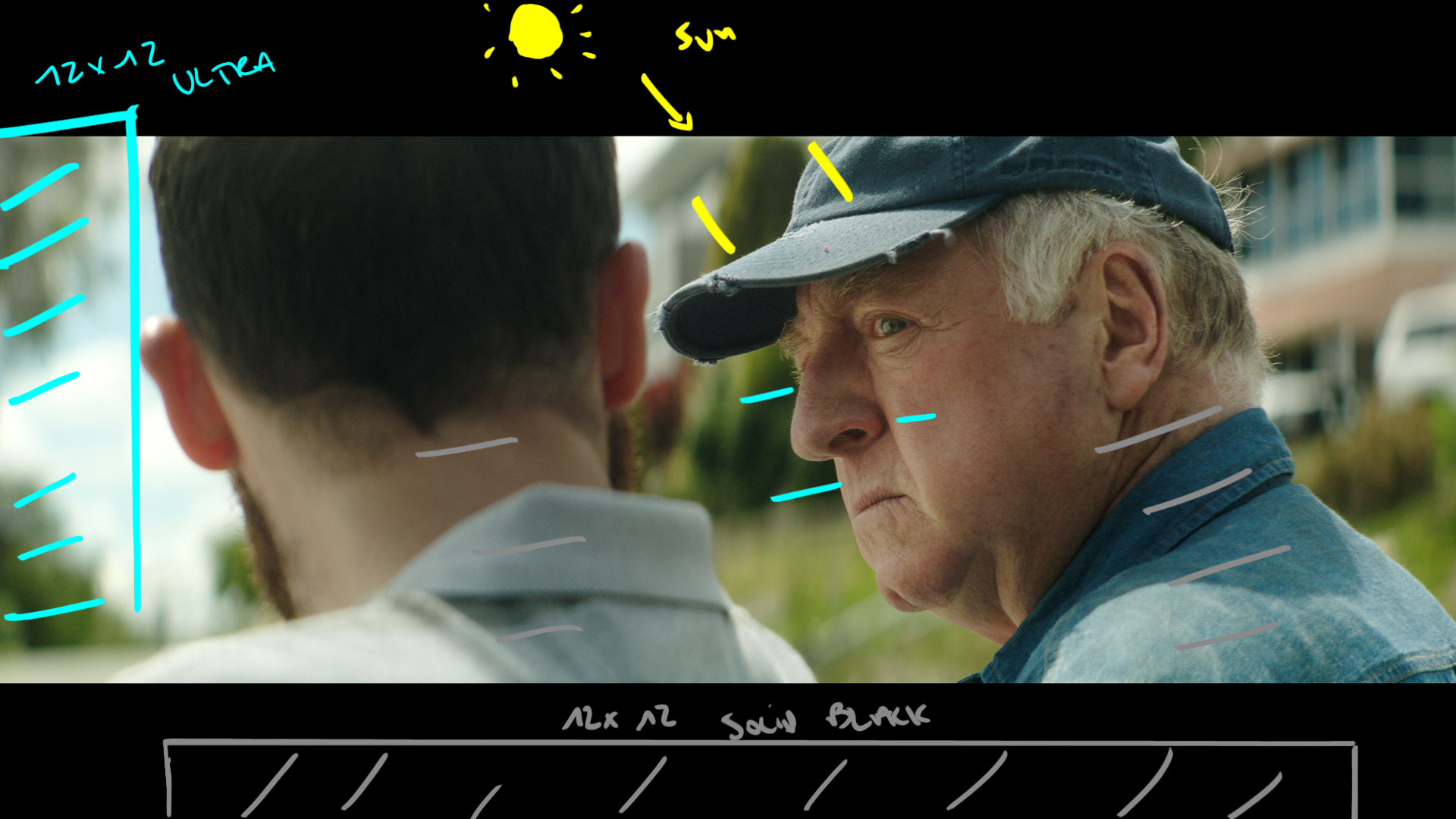
Our first shot of the day. We chose to start a little later to take advantage of a slightly higher sun. This shot is still back lit but we are trying to push in some of the front light to match the rest of the shots in the ad.
The Lighting
We have the sun in a bit of in and out high cloud for the back light edge. Then with a 12x12 Ultra we push light in from camera left and use neg fill behind the camera to create some contrast.
The Result
#2 The Match Shot
The Shot
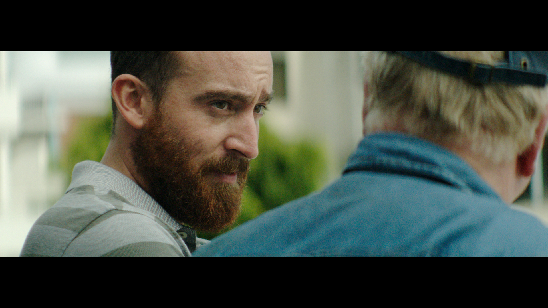
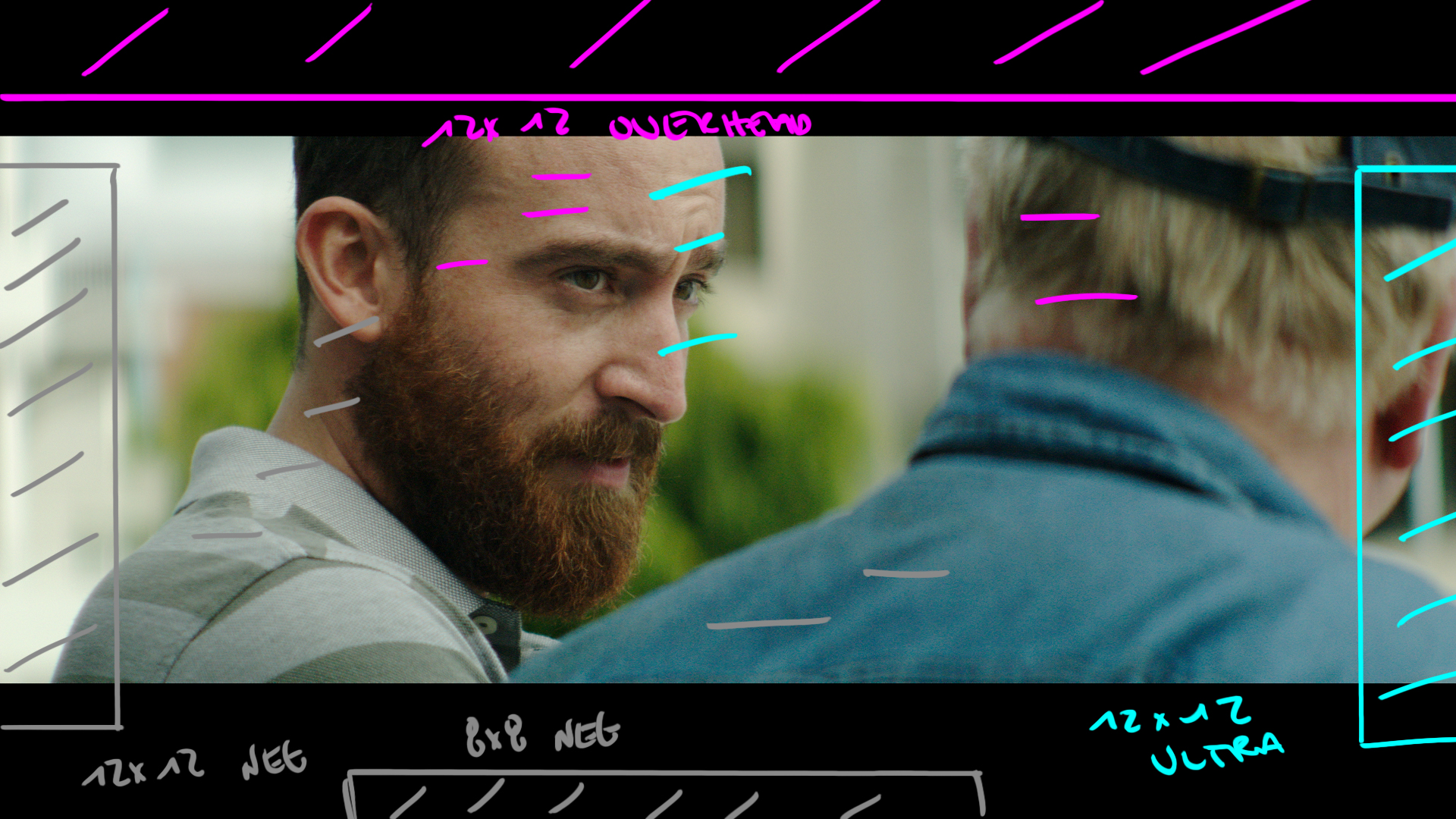
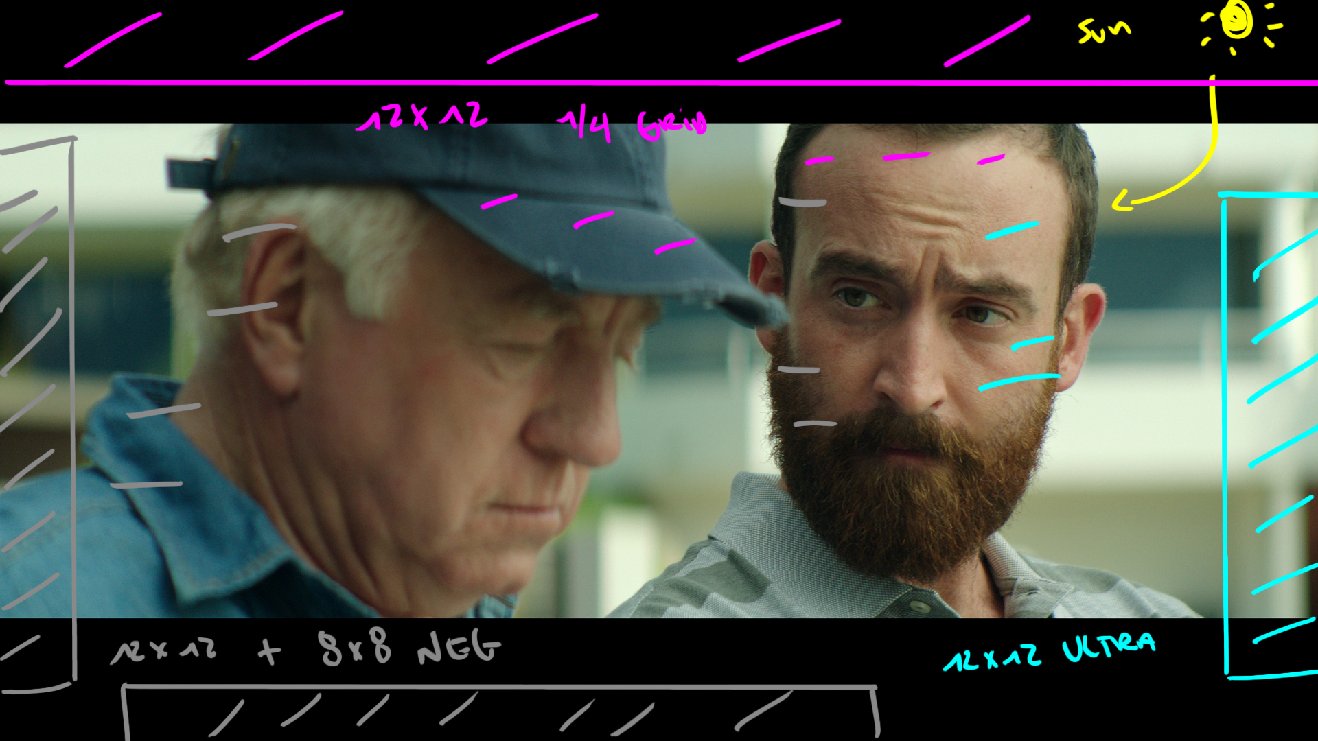
This begins our true look at fighting front light. Here we needed to keep light coming from the front but shape it to keep things interesting.
The Lighting
In this set up we introduced a 12x12 1/4 grid over head to take the harshness of the sun away. Then we use a very angled 12x12 bounce to get level underneath the over head. We make sure to shoot into a slightly darker background and then add Neg fill all the way around the image from camera left to behind camera.
The Result
#3 The Line Break - Swapping Sides
The Shot
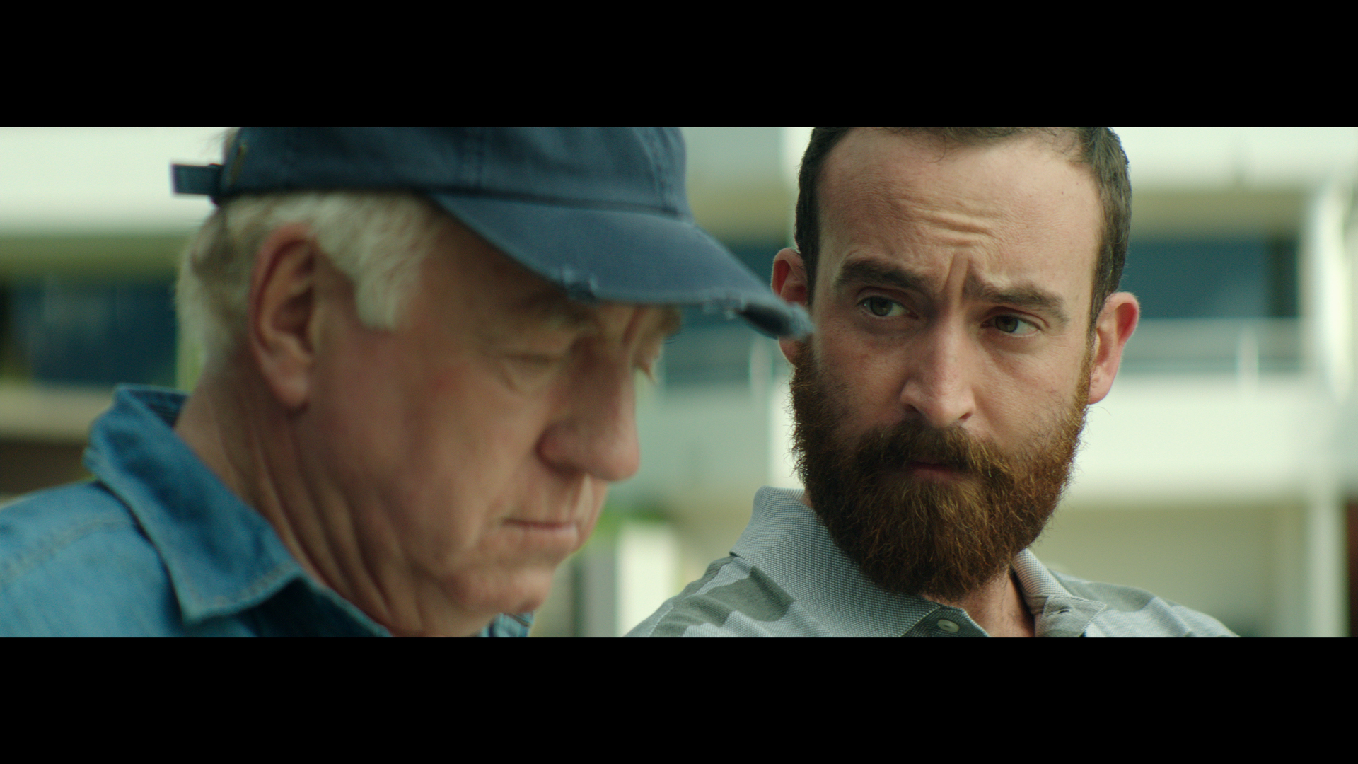
Now the camera flops sides of the line but remains facing in the same general direction. In this shot you can start to see how much contrast the neg fill adds to our talent's camera left cheek.
The Lighting
Same as above.
The Result
#4 The Reveal - Magic
The Shot
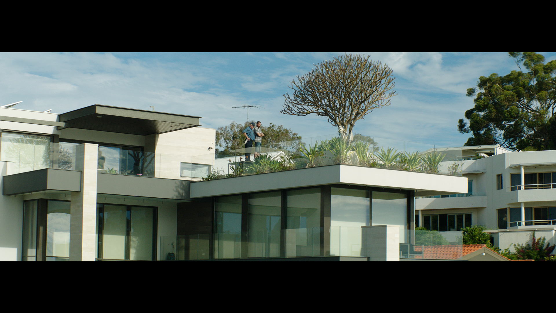
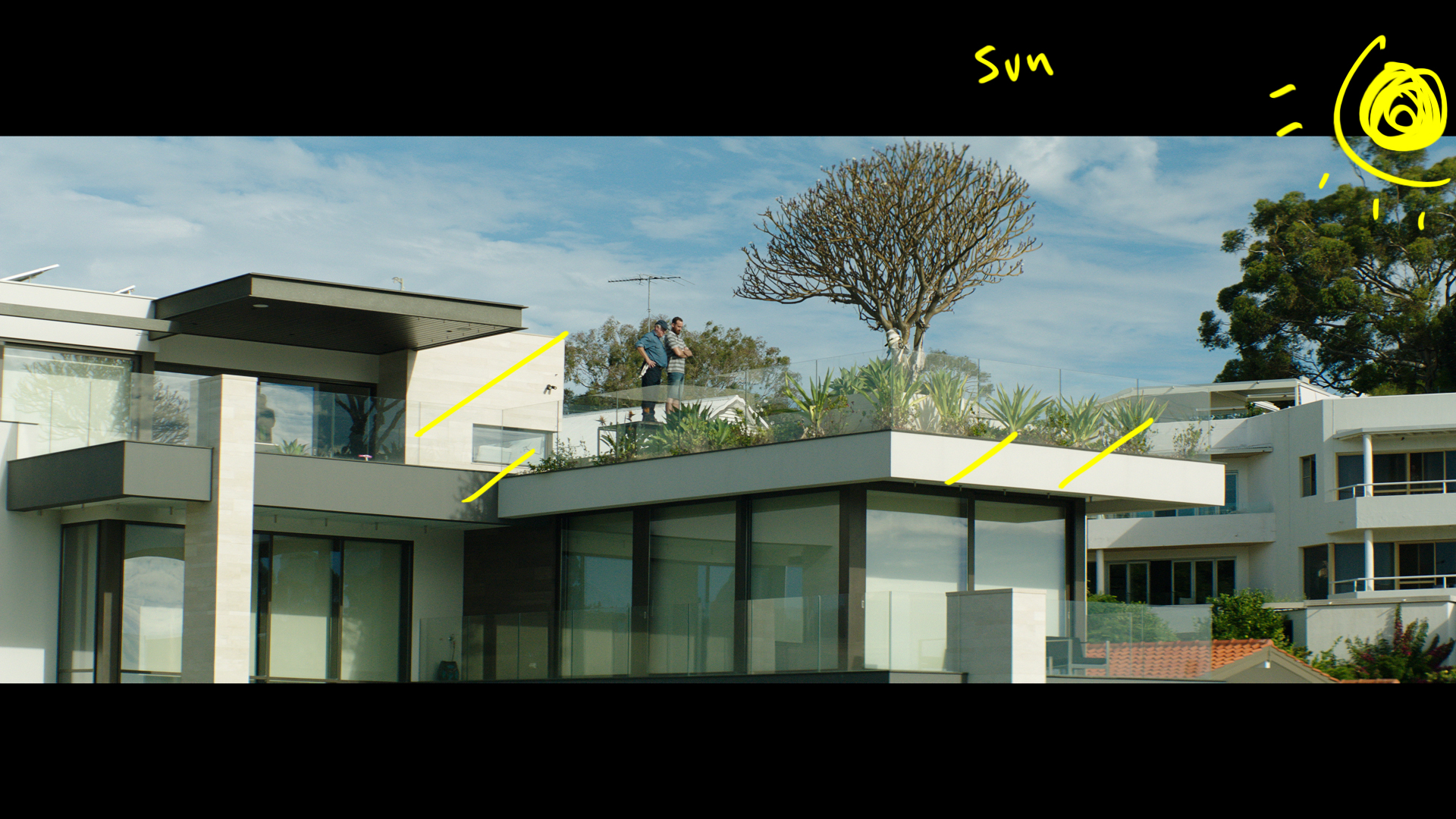
This shot is the enitre we reason we needed front light in the first place. The orientation of the house meant it would never be back lit. We chose to shoot this last so the sun would be as low as possible while still maintaining that daylight feel.
The Lighting
No lighting here apart from the sun.
The Result
Just a rough comp of what the final shot would include.
More Day Exterior Shots - Front Light/Side Light/Back Light
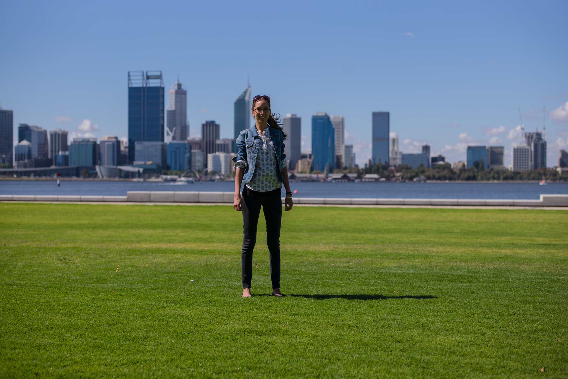
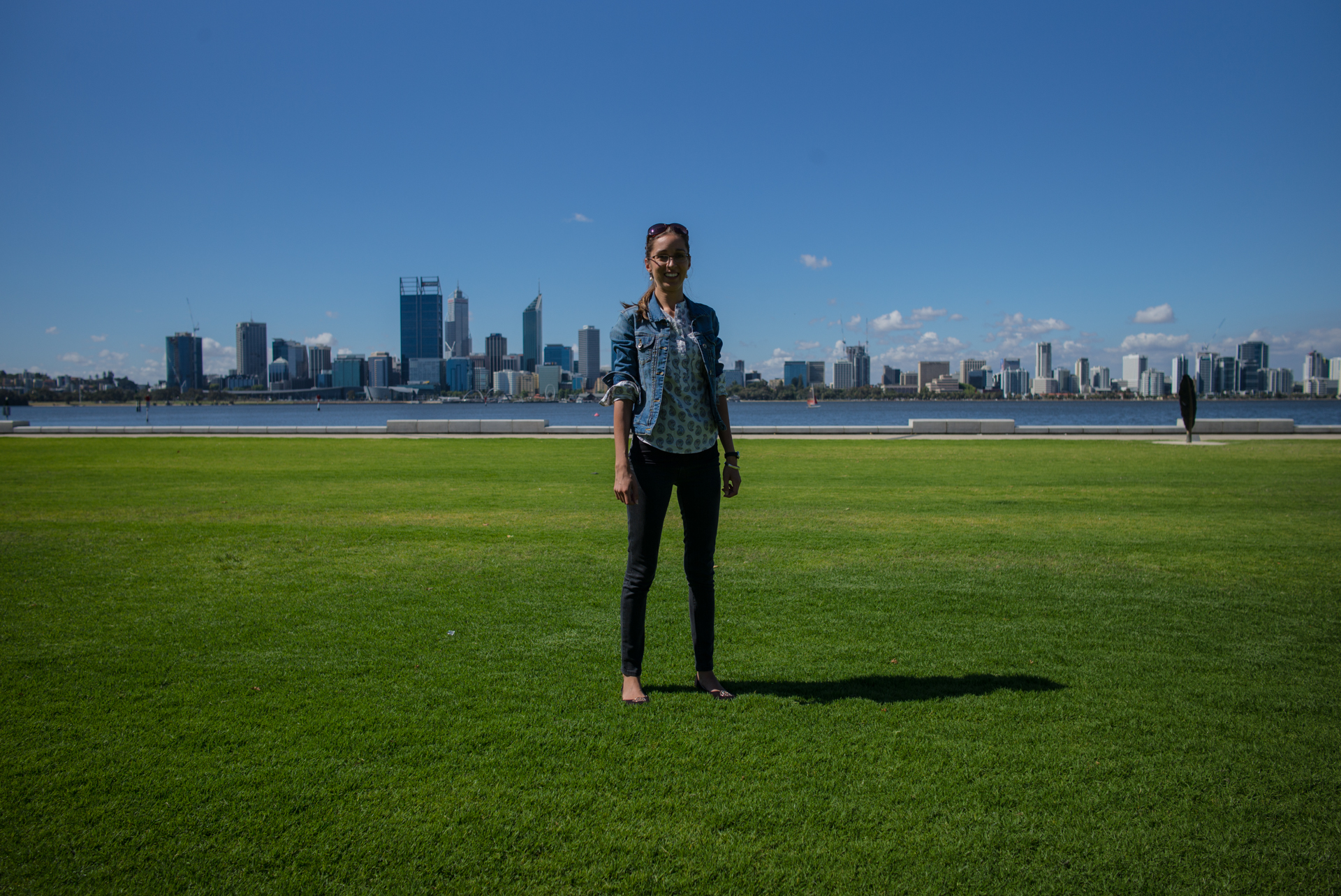
Below are a few more examples of day exteriors and using the sun to your advantage. You can see some location stills from the director below and then the final images underneath.
Shot #5 - The Wide
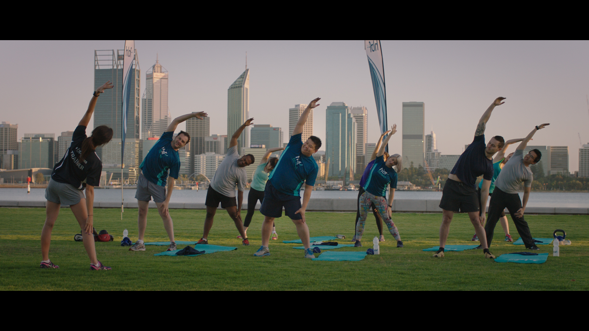
The Shot
For this opening set up we wanted the sun as low as possible. With a low sun creating a nice soft light in the ambient sky the only thing we had to do was turn on the camera.
The Lighting
No lighting here apart from being here early enough to get the soft shadows and proper angle of the sun on the BG buildings.
The Results
Shot #7 - The Right Back Light
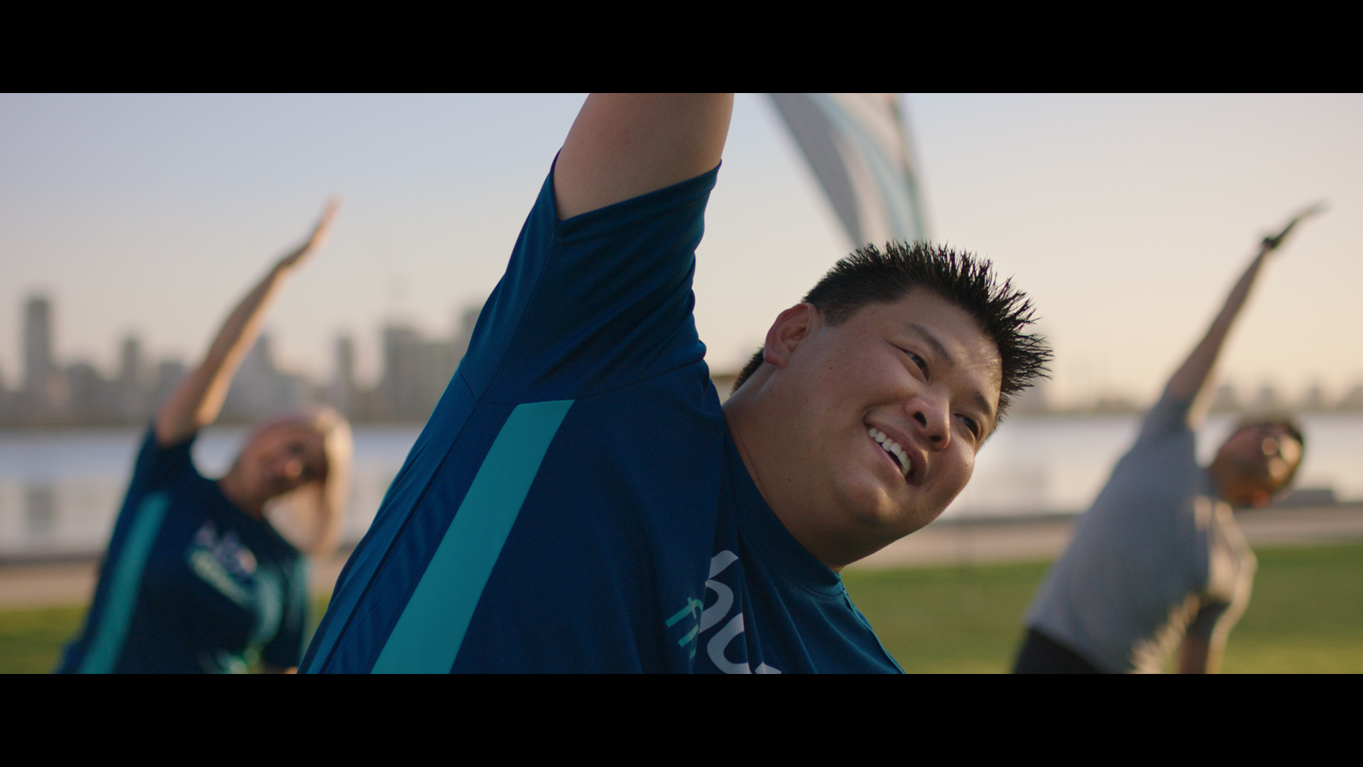
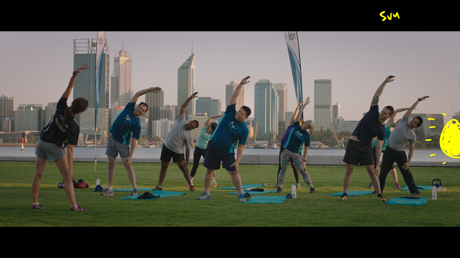
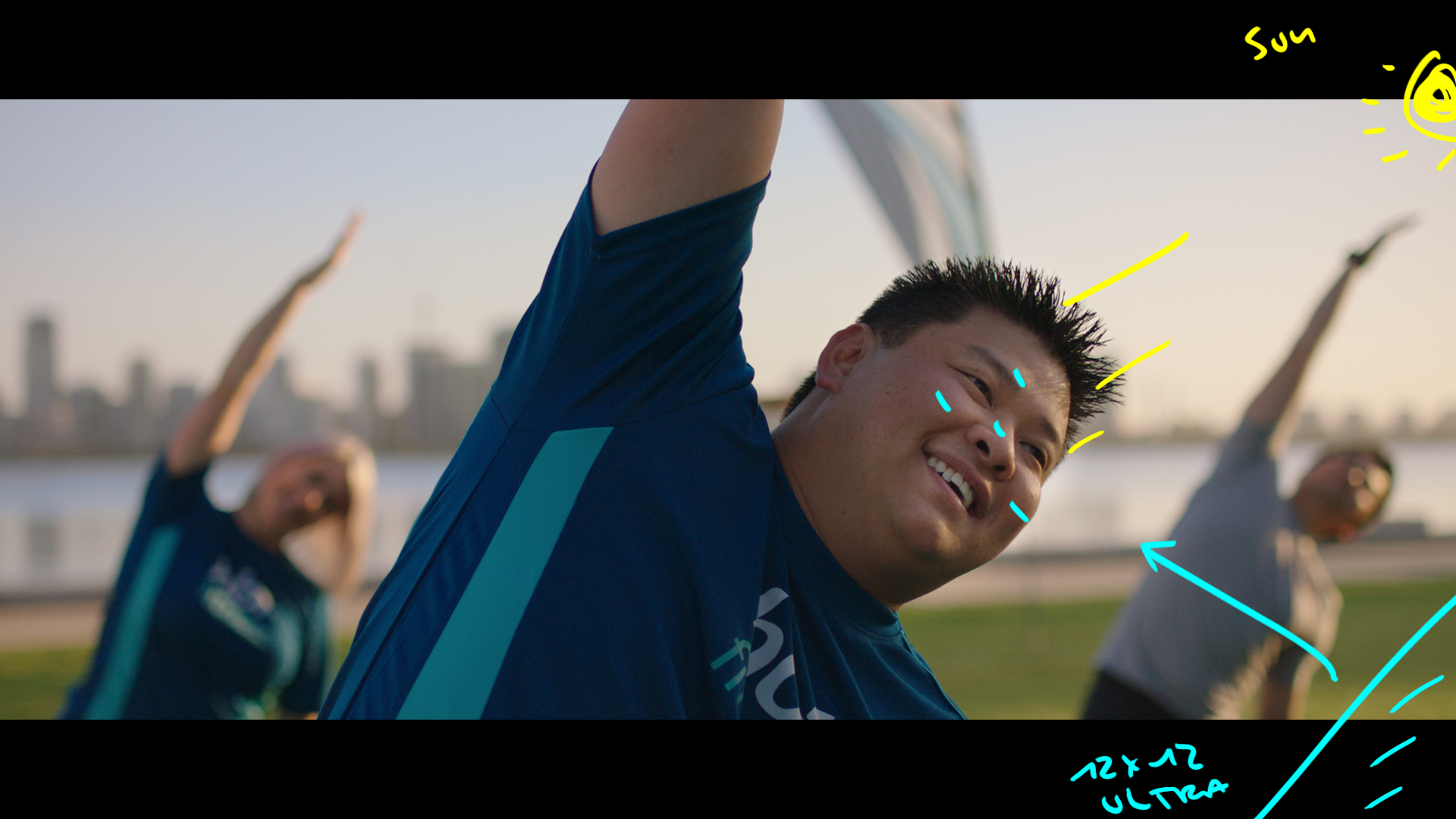
The Shot
We jumped in to get various angles once the wide was taken care of. This example is my preferred angle for camera relative to back light. It saves us from smooshing our talent with light from two angles.
The Lighting
We added a 12x12 ultra bounce to camera right but it wasn't being hit with direct. Just by being big and white it lifts the shadows ever so slightly.
The Result
Shot #7 - The Dreaded Sandwich
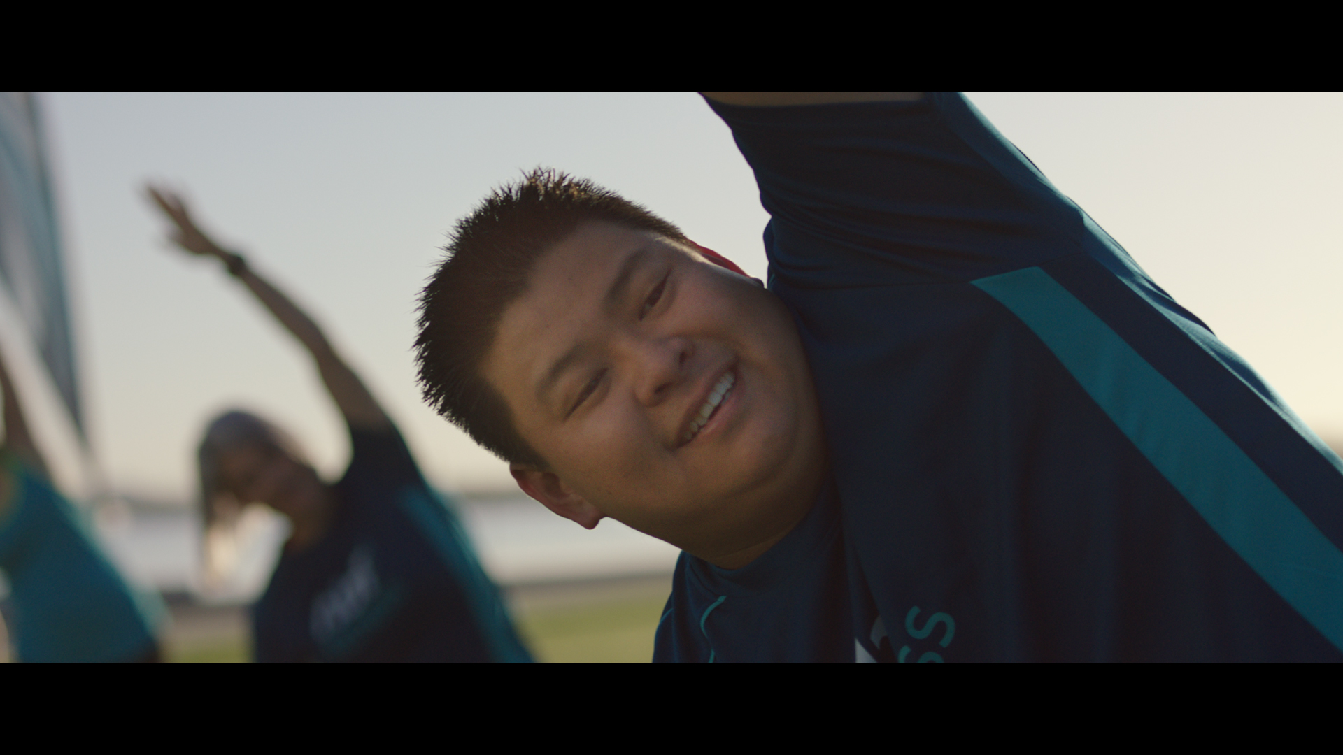
The Shot
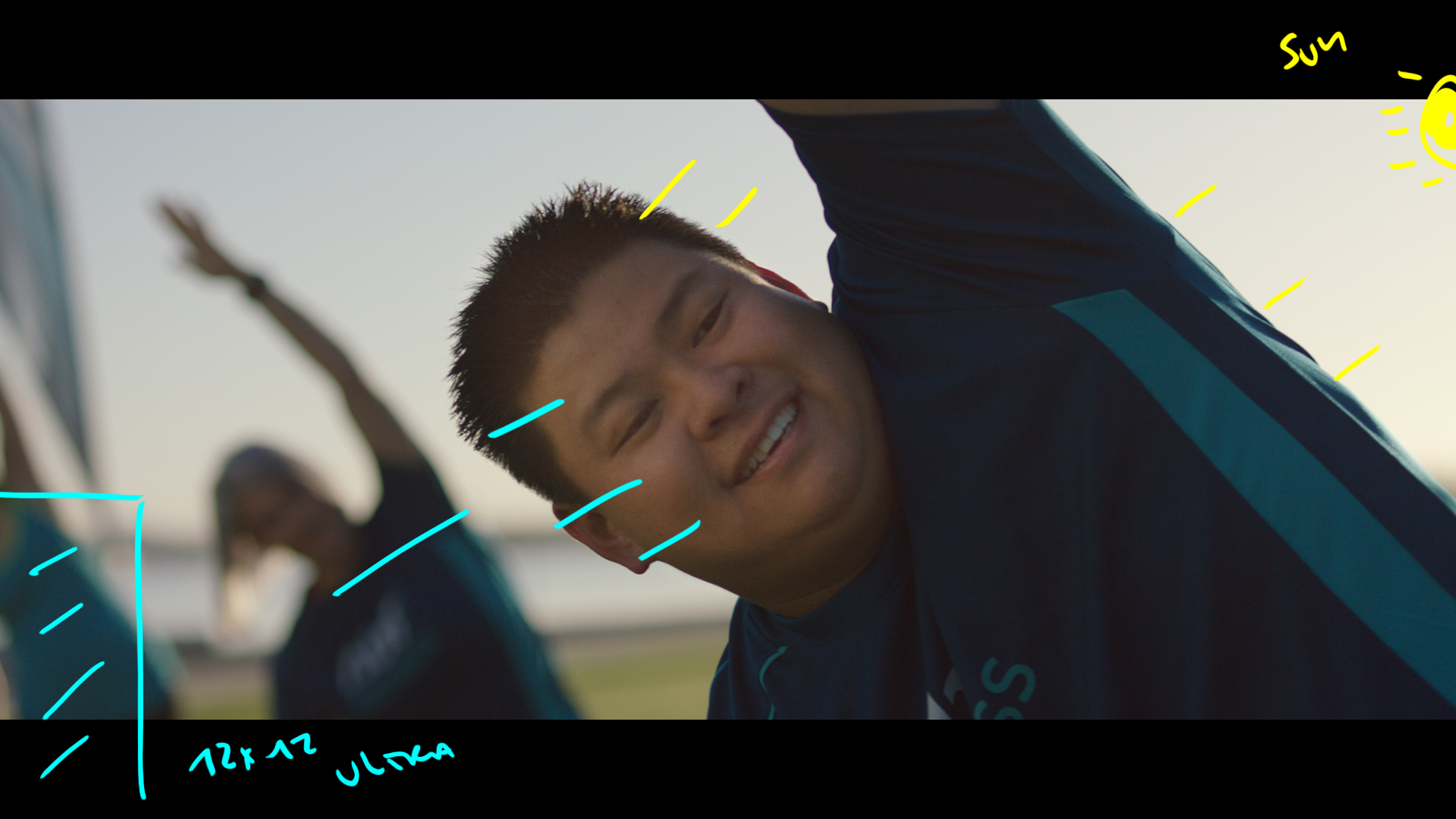
This is exactly the same as before except now we changed the angle of the talent relative to the sun.
The Lighting
The problem now is that because the sun is camera right and the talent looking camera left we have to send the sun back from the opposite angle. Thus creating light from two sides which is the sun sandwich.
The Result


With absolutely no lights, it shows the power of shaping light and just how much it adds to ones images. These are some beautiful images and a great article as always. One question from the kit though. Why external NDs and not the ARRI Alexa’s in-built ones. I was under the impression that they are made especially to keep the colours of the Alexa as untouched as possible. Is there an advantage to these?
Thanks again.