Listen to the Podcast
On the show today we break down a bit of a different commercial. One of the best parts about being a cinematographer is the wide range of projects you get asked to work on. One week you have one set of problems to solve and the next week you've got an entirely new set of issues in front of you.
This week we are looking at the challenges of lighting and shooting a tvc shot entirely from the 1st person POV. The viewer needs to feel like they are the person in the middle of the action. There are a number of unique challenges when it comes to capturing a scene from this perspective and we take a behind the scenes look at how we got it done.
Patreon Podcast: Green Screen Work
On the Patreon podcast this week I answer a few different listener questions on lighting and working with green and blue screens. I've also provided some examples from various shoots and we break them down to see the lighting and how it integrates with the VFX footage.
To listen to the Patreon Podcast click the link below:
Patreon Podcast: Green Screen Work
The Future - VR Bits and Pieces
The Unity Behind the Scenes Clip
The Steadiman Demo of his VR Camera Simulator
The Commercial - Point of View
The ad follows around college students as they take their classes on any given day. The viewer takes over their body and we are given a 1st person glimpse of what life as a student might be like.
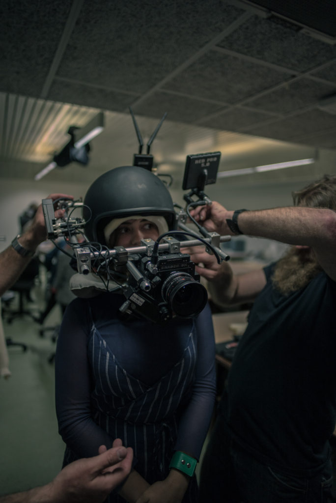
The main technical challenge was coming up with a rig that would allow us to capture that perspective while still maintaining a high image quality.
In the end we chose a RED Weapon paired with a set of Standard Speeds. For the focal lengths we mainly stayed on the 24mm and 32mm. The RED was a bit skinnier than the Alexa Mini which meant the talent or however else was wearing the rig could still have some ability to see their surroundings.
Our grip constructed a head mount from a motorcycle helmet that was then offset with the camera in the front and the battery and power solutions in the back. We found that it wasn't so much the total weight of the rig but rather how that weight was distributed that made the largest difference in comfort and operability.
The Shots - Point of View
The main camera issue besides the rig was too always have the camera moving to make the action feel more intimate. Each sequence we look at has lots of things traveling in front and past the camera to help accentuate the idea that the viewer is right in the middle of the action.
The Fashion Show

The Shot
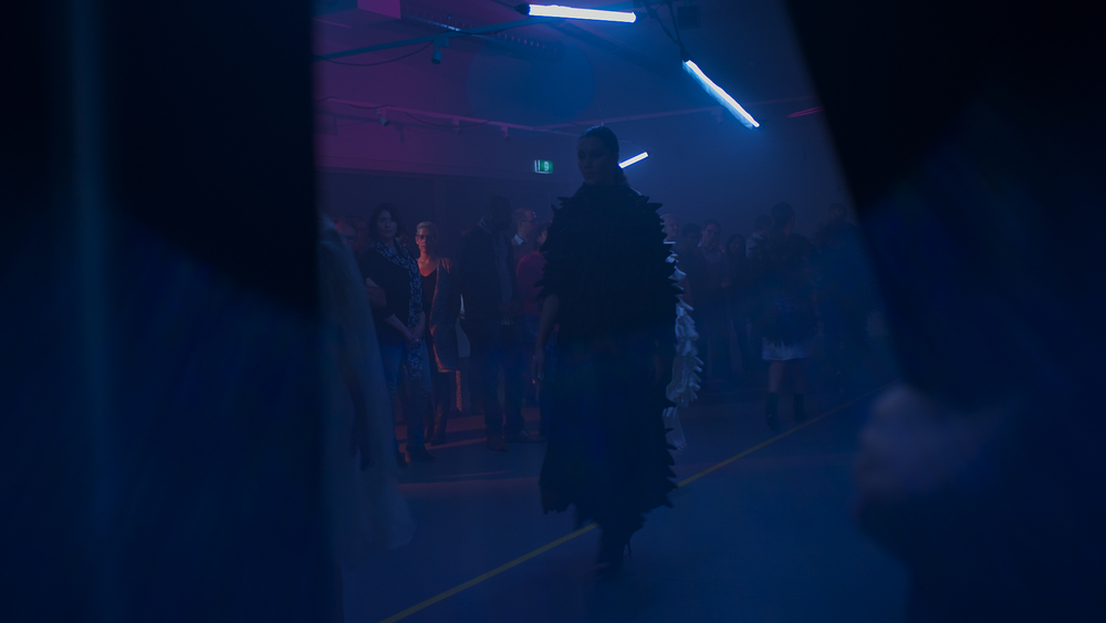
This first shot is a reveal of a student fashion show. A hand from the POV cam sticks out and pulls back the curtain to reveal the show.
The Lighting
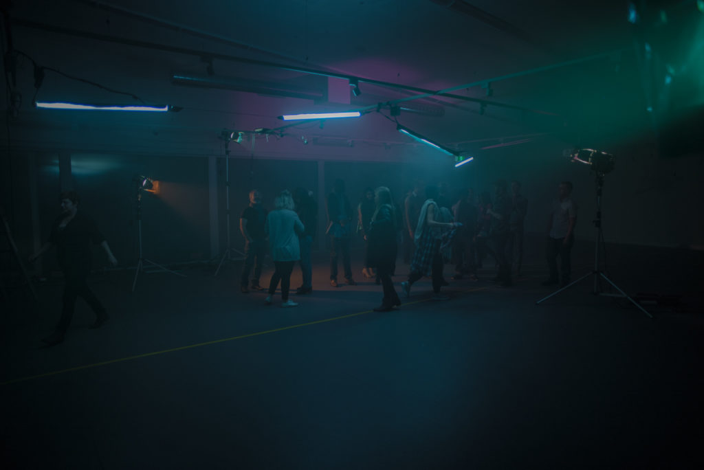
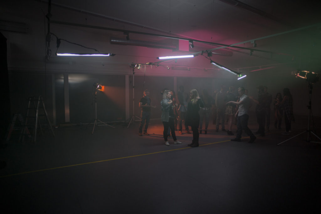
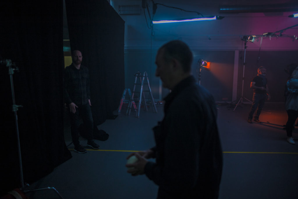
This was a large, white, empty room with no windows stuck in the middle of a college campus. We had limited extras and not a lot of time but we wanted to make the space feel a bit different.
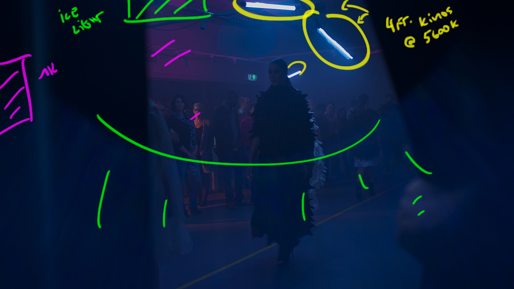
Down the runway we had single Kino daylight bulbs strung and various angles to give us the cat walk look. Then in the background we had some 1ks with amber and pink gels to help create some interesting color contrast in the BG.
Just above the lens the gaffer used a generic daylight LED flashlight to pound light straight into the lens to create the flare effect.
The Results
Behind the Scenes
The Courtroom - More White Walls
The Shots
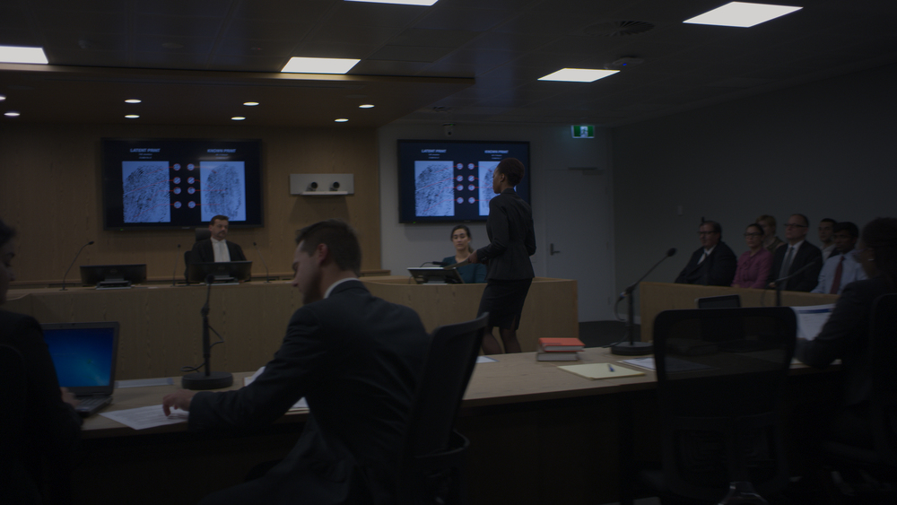
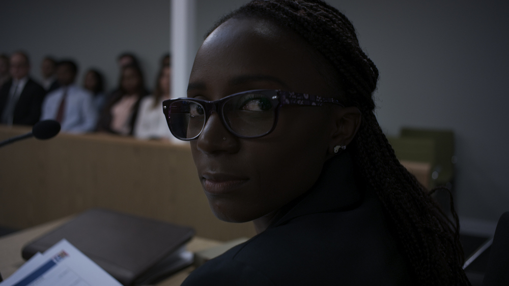
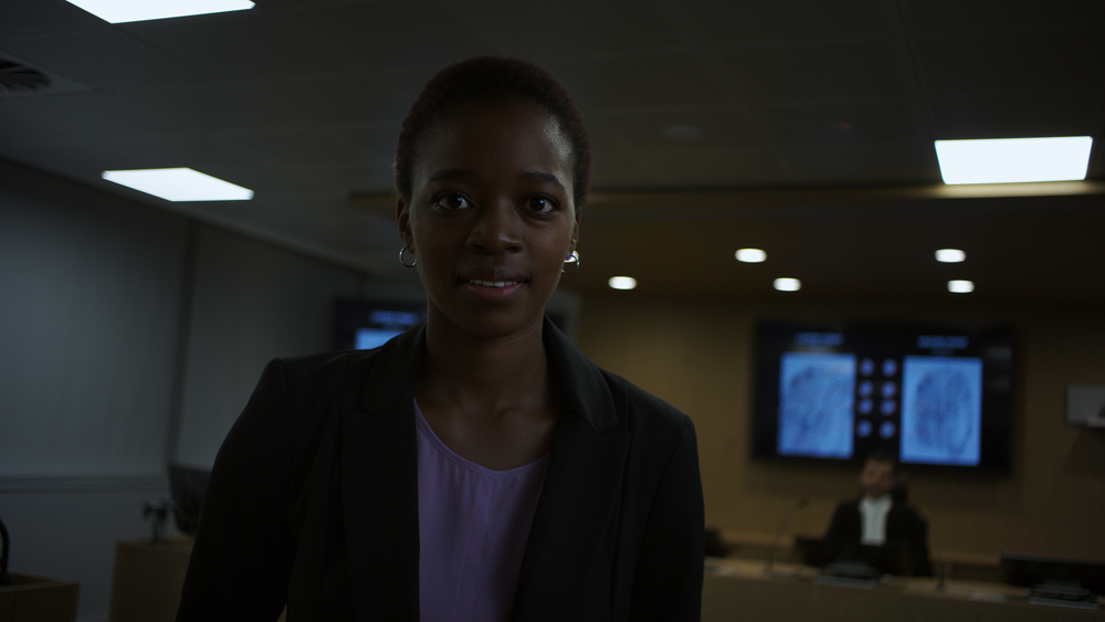
This series of shots was of a student entering a courtroom, talking with someone on their side at their bench then being handed some documents from a clerk.
The Lighting
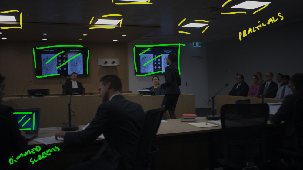
The practical lighting was overhead fluorescents and terrible. We didn't have the time or the budget to change all the tubes out so we shut off all the lamps around the edges of the room to give the BG some shape and keep the level on the walls down.
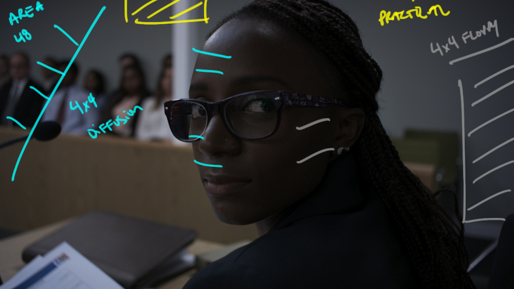
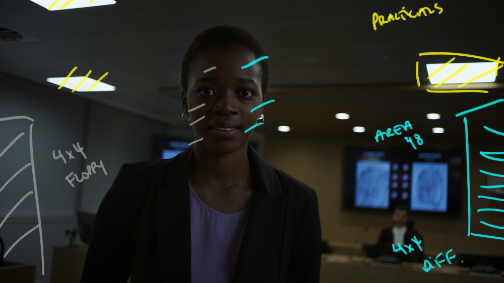
Then over the action we rigged some Area 48 LEDs through 4x4 frames of diffusion to soften them. WE used 4x4 floppies on the talent to help create some shape and then played with the angle of the Area 48s to keep them toppy enough to somewhat match the practicals but angled enough to make them look halfway decent.
The Results
The Paramedic - Inside the Car
The Shot
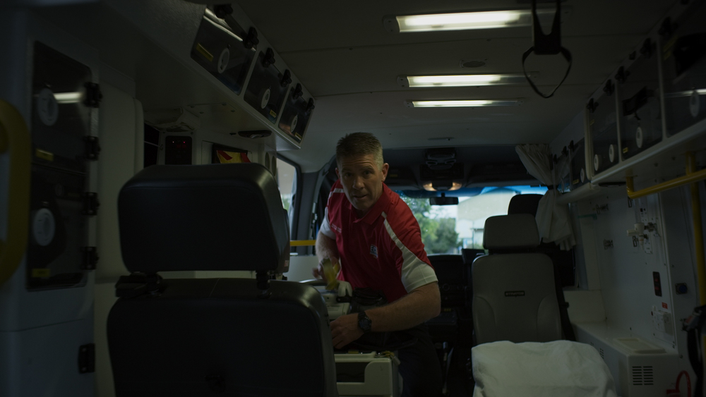
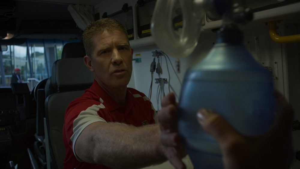
For this series of shots we needed some action inside the Paramedics van. The challenge was getting enough level inside to not completely have to blow out the windows in the BG.
The Lighting
We first chose spot to park the car so the direction we were looking was not being blasted with front light. We chose an area with a bit of foliage to make it a bit more intersting in the BG.
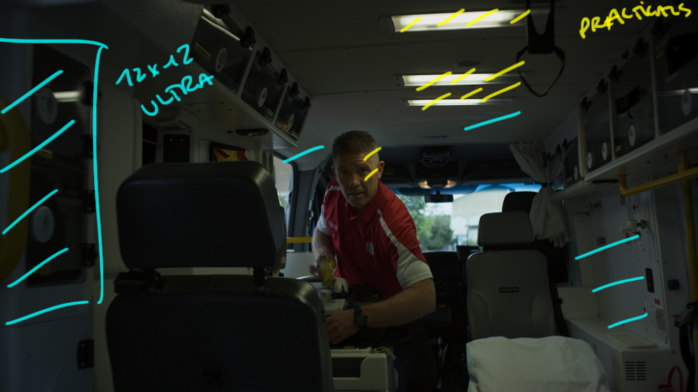
Because we started outside the van, open the doors and enter we needed tons of level inside the car to be able to balance out the inside with the outside.
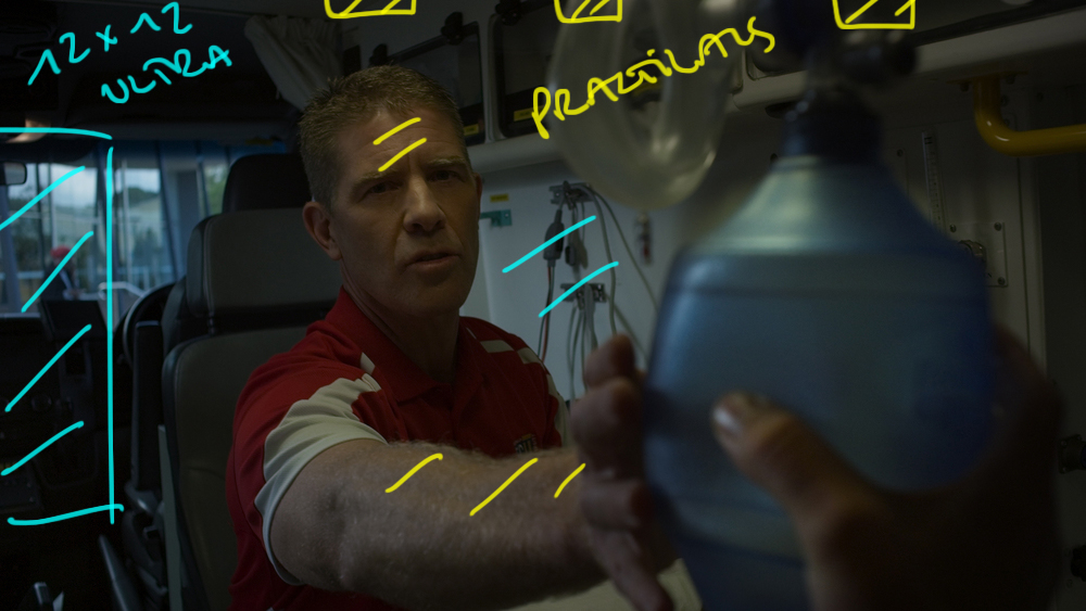
WE used the practical lights inside the vehicle but even that wasn't enough. To get more daylight level we added a 12x12 Ultra Bounce camera left and placed it just out of the edge of frame. The bounced light coming off of it was just enough to fill inside the cab.
We blocked the action so the talents was being somewhat shaped by the practical above and we were good to go.
The Results
Backstage - Point of View
The Shots
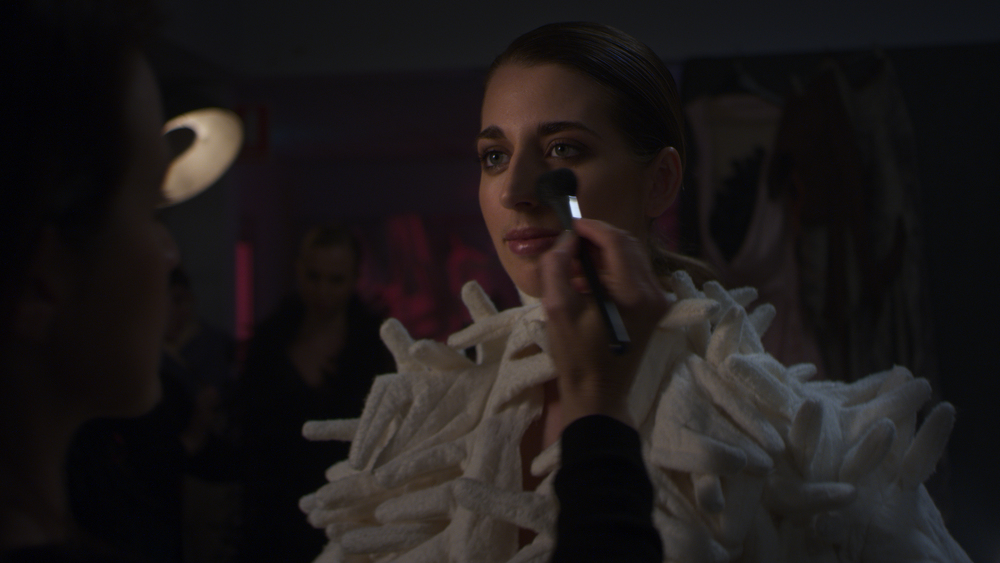
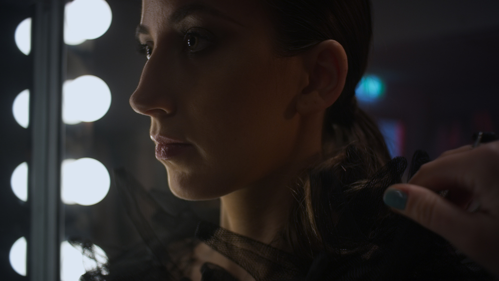
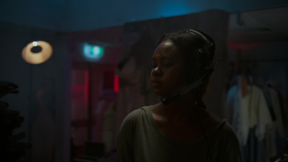
For this series of shots a designer is walking backstage preparing some models for the catwalk. People are busy and whizzing by the camera at a frantic pace.
The Lighting
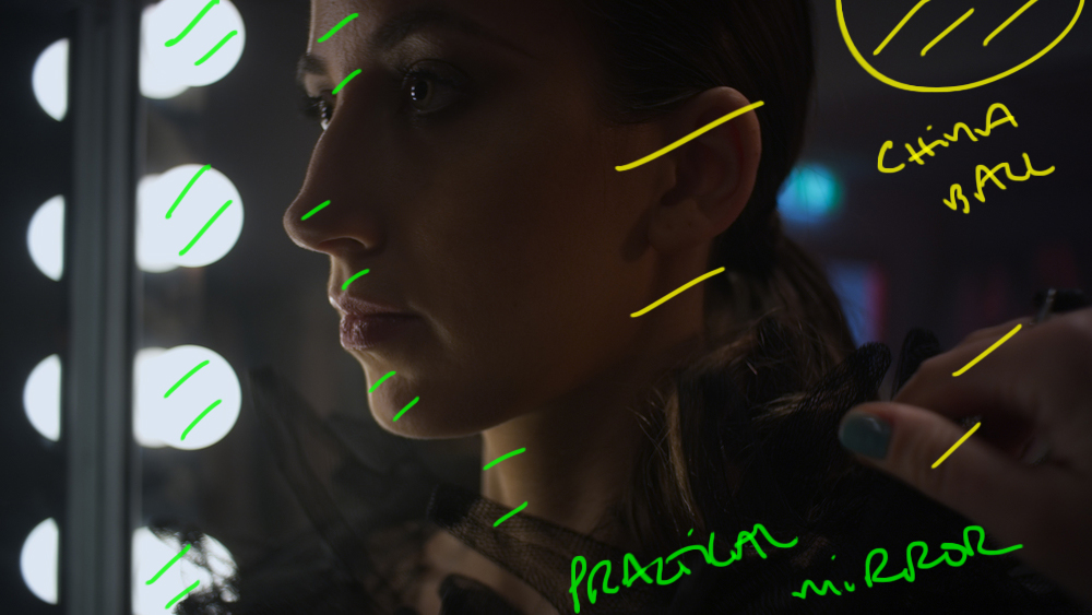
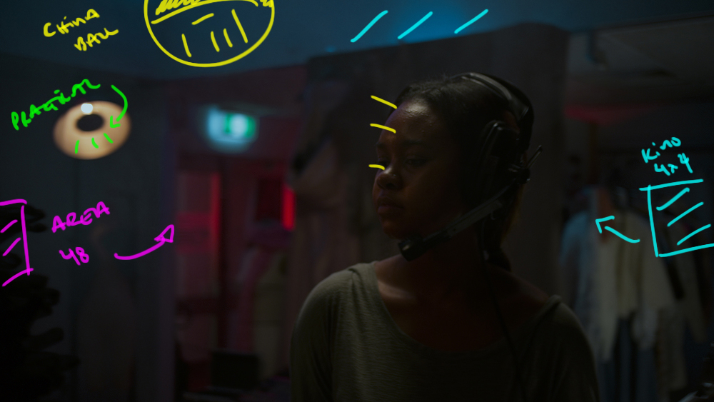
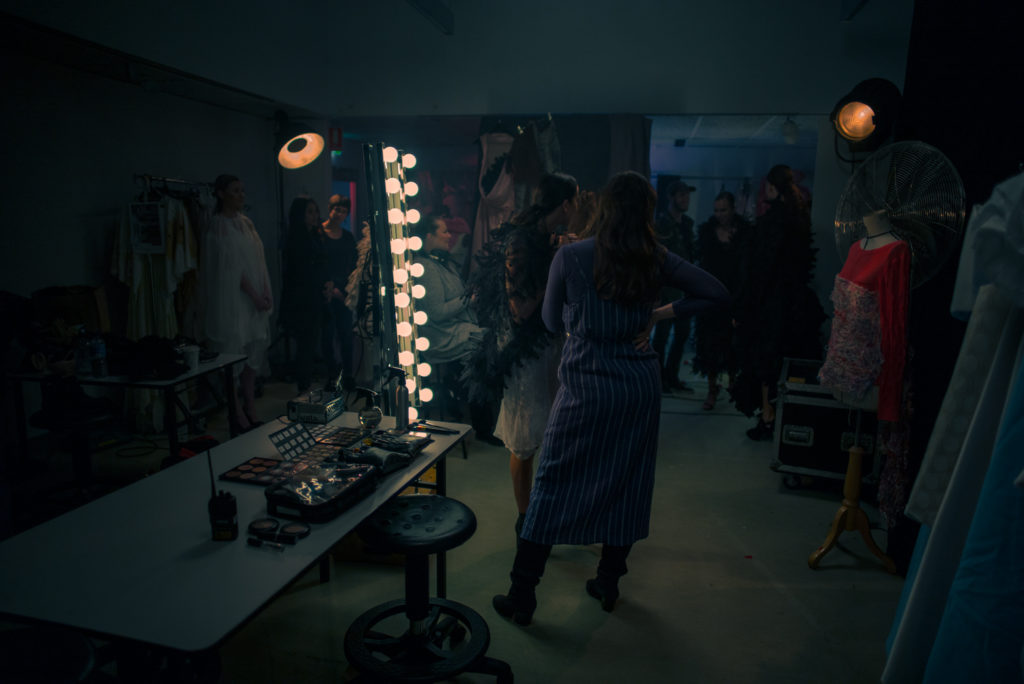
We wanted to tie the backstage look in with the catwalk look from before. There was quite a bit of choreography to go through to get the timing right and we were using fake camera flashes to accentuate some key moments.
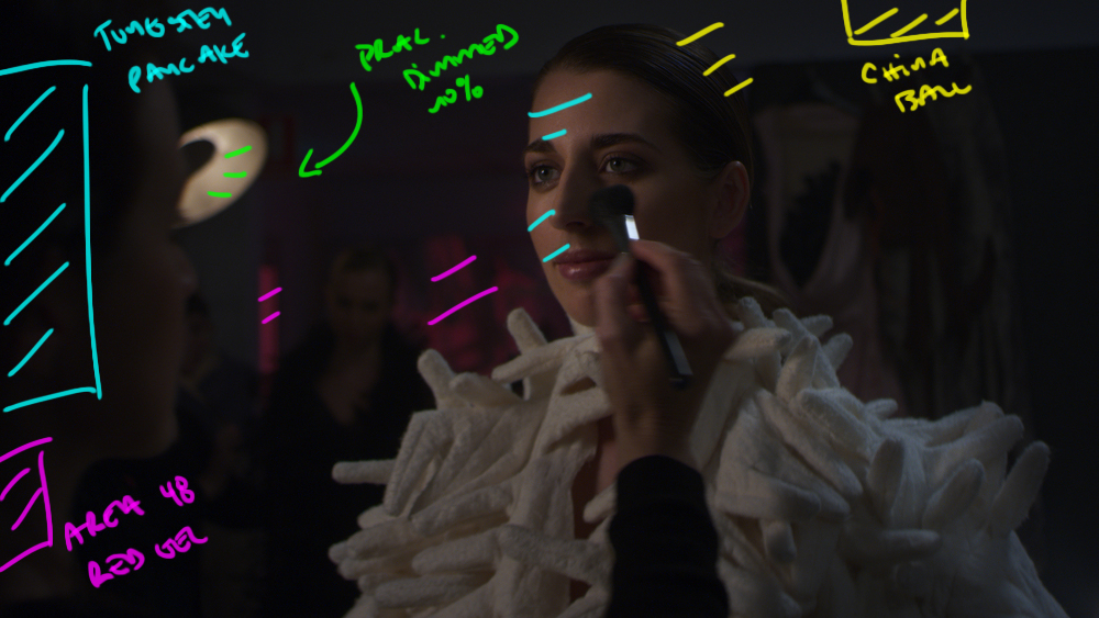
The dark mood was set using two large china balls positioned on the ceiling. They were completely black wrapped and dimmed to about 20%. That meant the color coming out was very warm and the ambient was very low.
In the BG we had some old movie lights that were again on dimmers and dimmed way down. We used a hazer to add some atmosphere and then positioned the practical mirrors in various locations around the room where we needed more level.
The blue in the background was from a kino daylight 4x4 with party blue gel and the red light was an Area 48 in the hallway with some strong red gel.
The Results
Behind the Scenes
The Light of Day - End Frame
The Shot
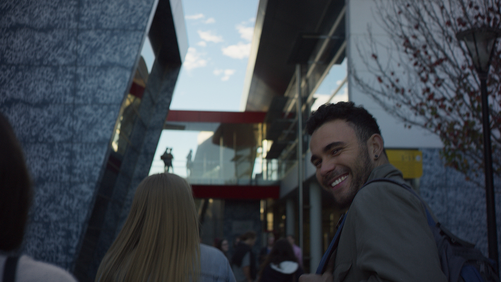
This shot was the end frame with the logo. The camera tilts up to blue sky and the logo appears. We needed a deep blue sky for the logo to read and we wanted an early morning feel to keep the shadows from being to deep.
The Lighting
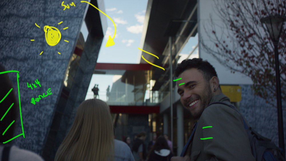
This was all about schedule and time of day. We scouted the various buildings around campus to see which interesting facades had orientations that would work for our schedule.
We wanted the sun low in the sky so that when we looked up we weren't staring straight into the sun plus a lower sun meant softer shadows when looking at the actual buildings.
The weather played nice and we got exactly what we were after.
The Results
POV Concepts - Unique Challenges
Every job offers cinematographers a chance to experiment with techniques and looks. POV jobs aren't something I would want to do every week but they are fun to dabble in from time to time.

