In this episode of The Wandering DP Podcast we continue our breakdown of a television commercial I recently shot. We look at dealing with problems on set and how I play the exposure game when equipment and crew are running thin.
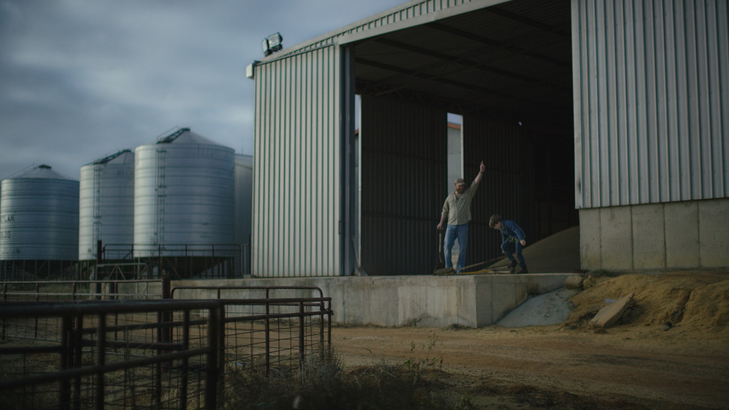
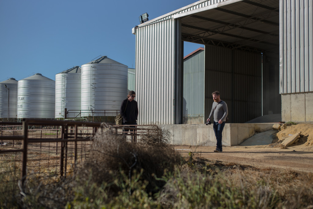
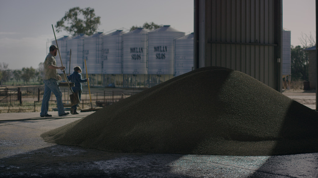
Shot #1 – The Wide
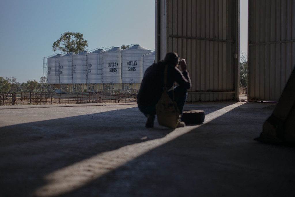
The Problems: Bright Sky, Dark inside of the Shed, No crew or gear to make sweeping changes
The Solution: Expose for the highs, add some light inside the shed, add a 12x Ultra bounce for the talent.
Final Shot:
Scout Image:
Shot #2: Moving In
The Problems: Bright Sky, Dark inside of shed, very directional (read harsh) light
The Solution: Diffusion Frames, Negative fill for shape.
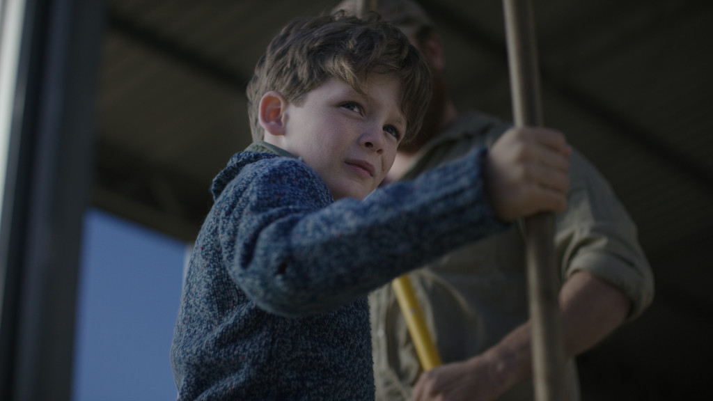
Shot #3: The Two Shot
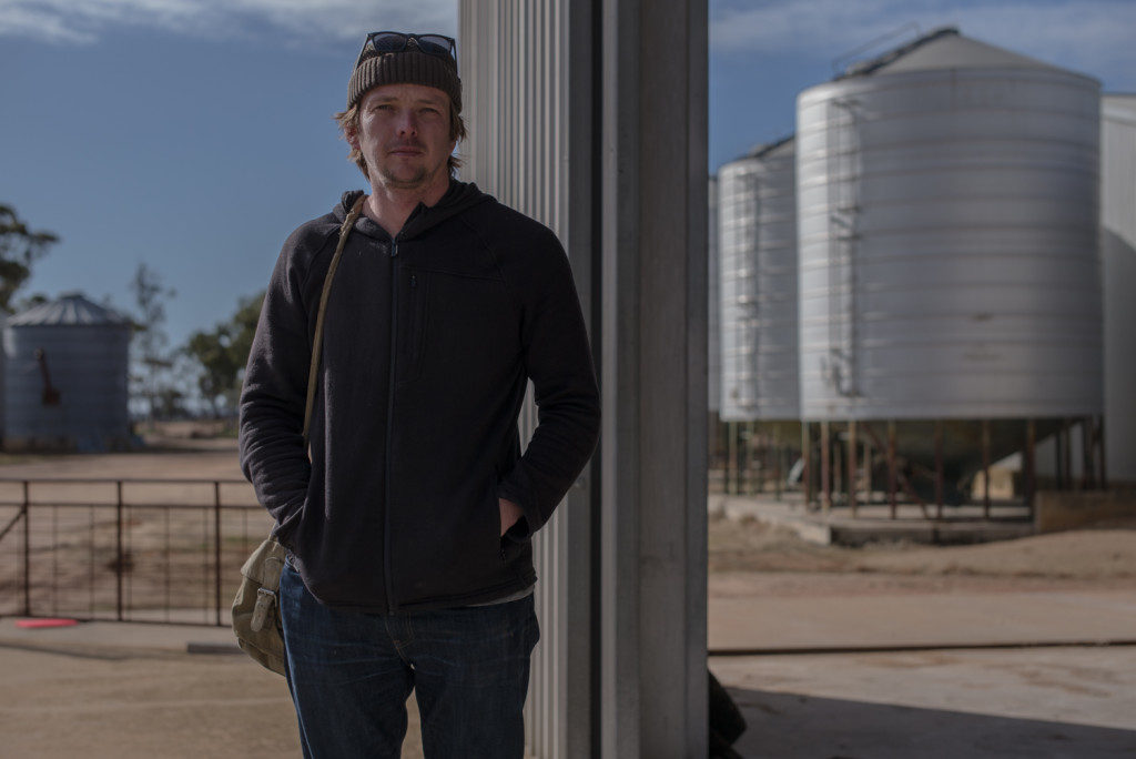
Scout Image:
Shot #4: The Walk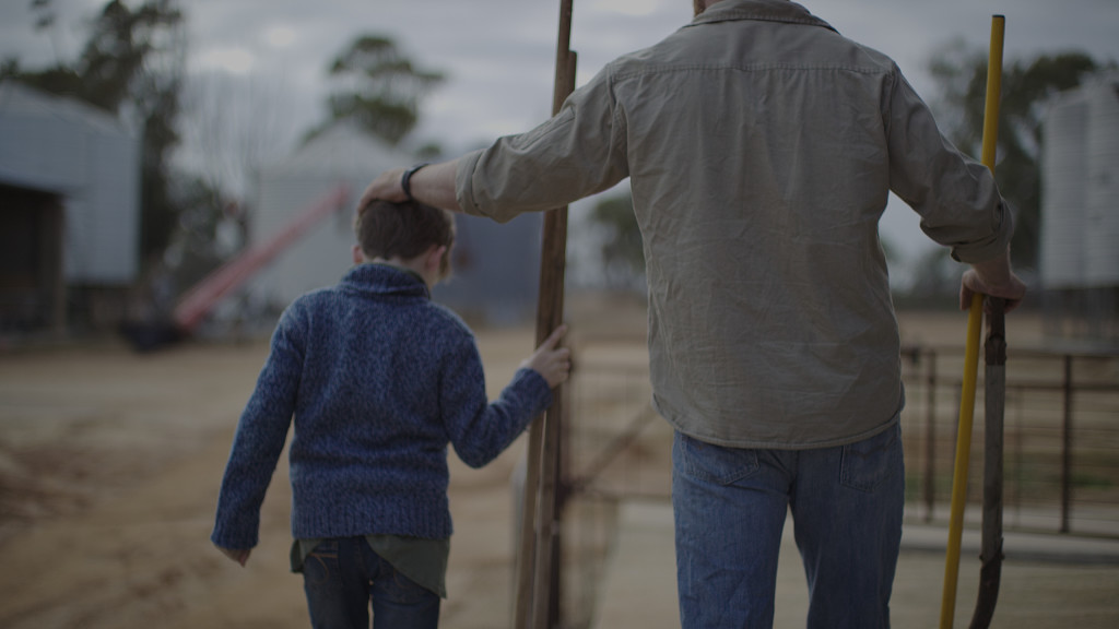
Shot #5: The Walk Wide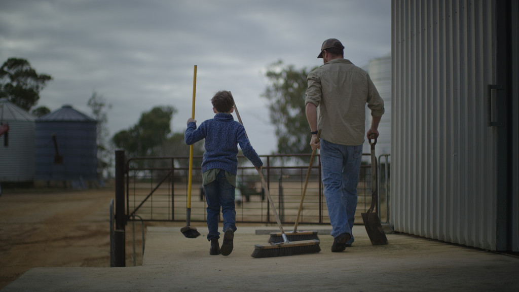
Shot #6: The Flip
The Problem: Gigantic Chasm of a difference between the highs and lows, No big guns to brighten it all up.
The Solution: Expose for the highs and add as much bounce and fill as we can.

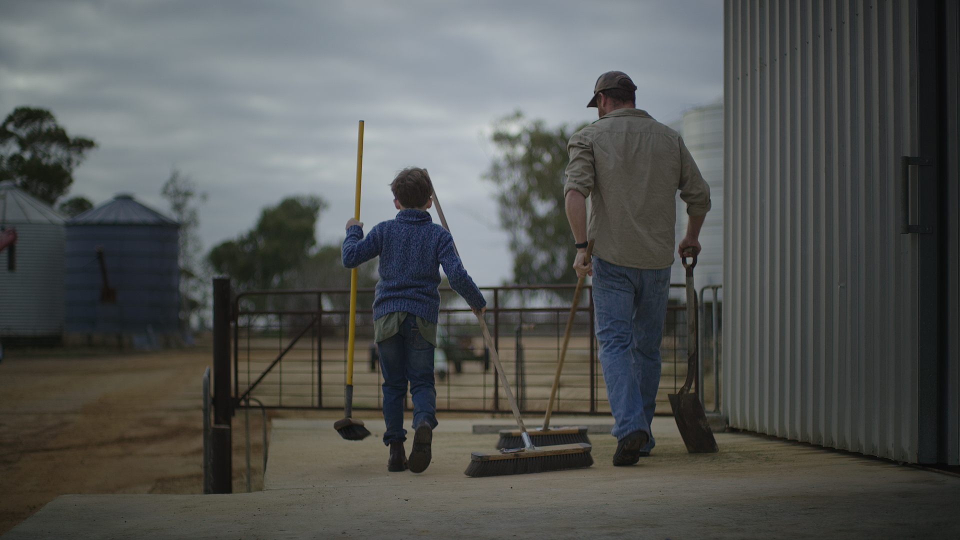
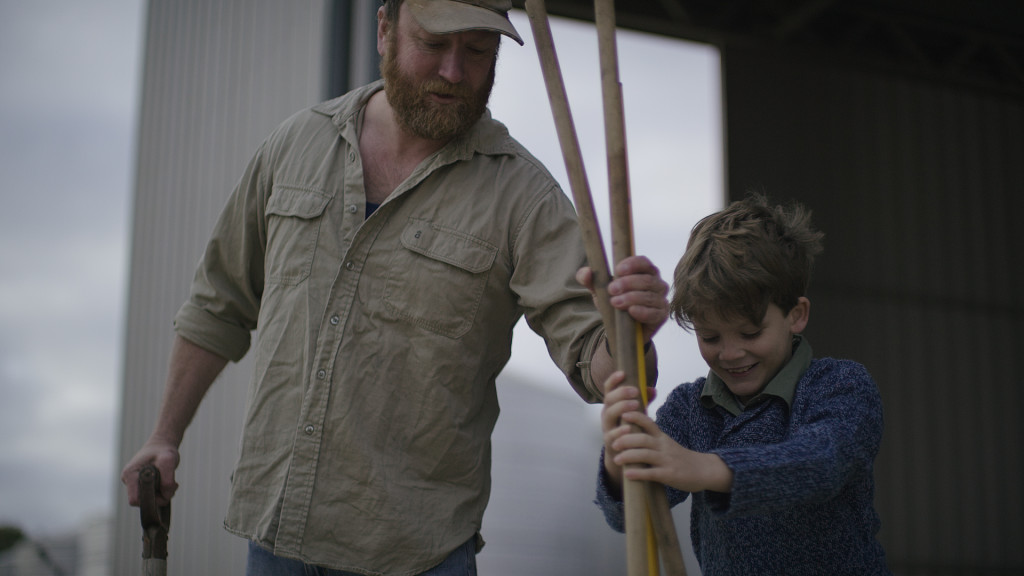
Thanks so much for all the info!! I love your podcast. Image #3 is my favorite too. My question is on image 3. I can see the negative fill on the father but I don’t see it on the little boy. I’m wondering if you may have had a small bounce on him? It seems right that he doesn’t have the negative fill on camera side. Just wondering if you did anything different considering he was the main subject and needed to stand out slightly from his father. Thanks again!! Can’t wait to see what you do next!
Hi Steven,
I think what you are seeing on the father is the neg fill from the 8x we had on camera right.
Then on the boy we had the neg fill just off to camera right almost behind me holding the camera. We couldn’t get it any closer to the boy because of the shed so we put it in a fronty/sidey position. It sort of cuts the light across the middle of his face. You can see it dark right around his lead eye.
Hope that helps!
Ah, yeah I can see it now. Thanks.
Hey Patrick just wondering if you would ever considering utilizing HDRx on the Dragon for this type of shoot to expose the other track for the hot sky. Or was it just not that intense of a difference to where you felt the highlight protection at 800 or 640 was enough room to bring down in the grade. Either way I love the look you were able to achieve with this one. Cheers